
Wednesday, May 25, 2011
Wednesday, May 18, 2011
4 Beautiful Websites
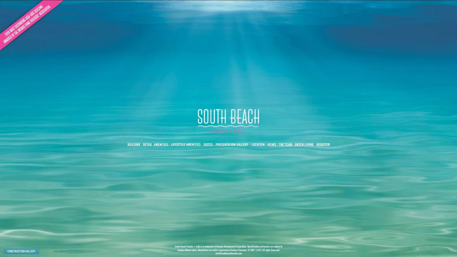
1. South Beach
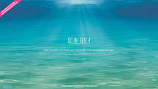
- Nice colour scheme
- Minimalistic
- Convenient and neat gallery display
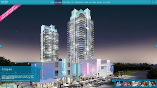
2. National Television
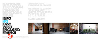
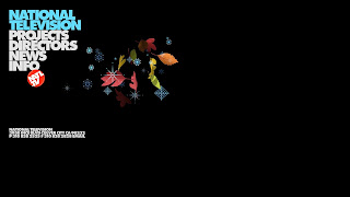
- Bold navigation bar ----> attention grabbing
- Simple layout, looks chic
- Lots of space for image display
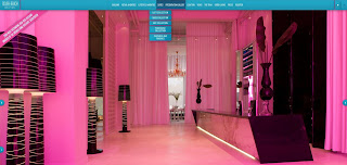
3. Erguvan Platin
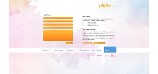
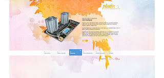
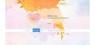
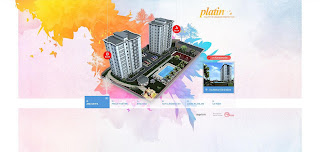
- Eye catching background
- Smooth transition between page
- Nice illustration
- Specially coloured form that looks more interesting than normal
4. Lorgans shop
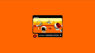
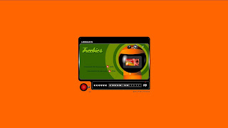
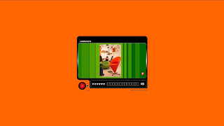
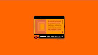
- Strong colour contrast
- Interesting interface that fits into a retro TV - very suitable for the theme of the shop: "RETRO"
- Buttons are made into elements of the TV. Interesting to navigate and interact


- Nice colour scheme
- Minimalistic
- Convenient and neat gallery display
2. National Television


- Bold navigation bar ----> attention grabbing
- Simple layout, looks chic
- Lots of space for image display
3. Erguvan Platin


- Eye catching background
- Smooth transition between page
- Nice illustration
- Specially coloured form that looks more interesting than normal
4. Lorgans shop


- Strong colour contrast
- Interesting interface that fits into a retro TV - very suitable for the theme of the shop: "RETRO"
- Buttons are made into elements of the TV. Interesting to navigate and interact
4 Design tutorials
Due to the design I have in mind for the website revamp projects, I'm more interested in websites that focus much on showcasing images rather than text. That explains why I picked 2 photographic interface design tutorial here.
The look I intend to go for is a bit futuristic so I'd include a tutorial on how to make glossy buttons
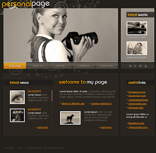
1. Personal page tutorial : HERE
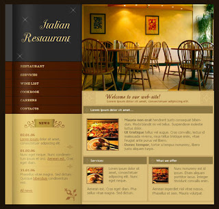
2. Restaurant page interface: HERE
3. Glossy buttons tutorial: HERE
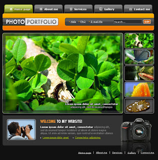
4. Photo Portfolio interface design: HERE
The look I intend to go for is a bit futuristic so I'd include a tutorial on how to make glossy buttons
1. Personal page tutorial : HERE

2. Restaurant page interface: HERE

3. Glossy buttons tutorial: HERE

4. Photo Portfolio interface design: HERE

Sunday, May 15, 2011
Competitor Site 4: WIP
Screen Caps


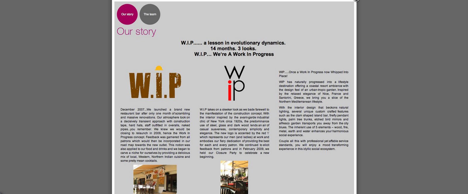
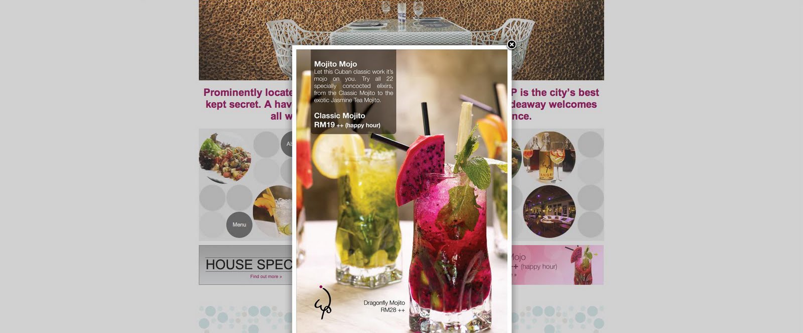
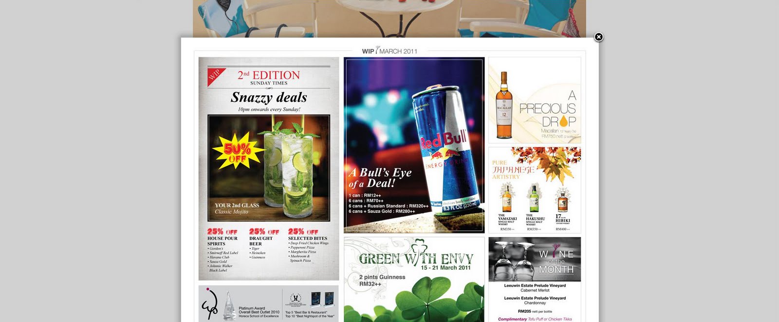
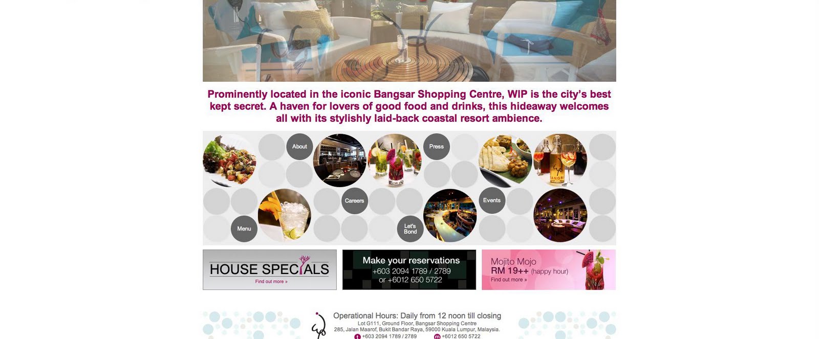

Site: http://wip.com.my/
Feedbacks:
1) Content-wise
- Lots of text
2) Design-wise
- Website look Flat
- Navigation buttons too blend into background
- Headline of the website doesnt' fit into colour scheme. Inconsistency in design. Typography can be improved since the catch line looks so out of place
- Buttons design should be more polished
- Gallery page looks boring
3) Function-wise
- Pop up window are suitable for some contents ( like promotions etc. ) But not all. Sometimes it become annoying
Competitor Site 3: Sky Bar
Screen Caps

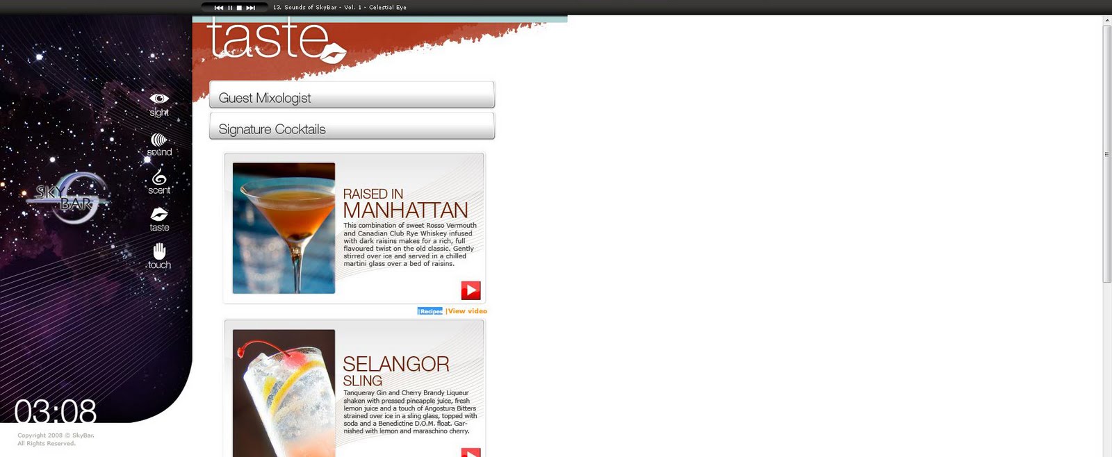
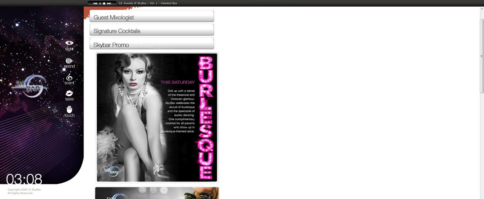
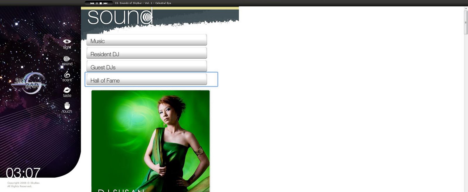
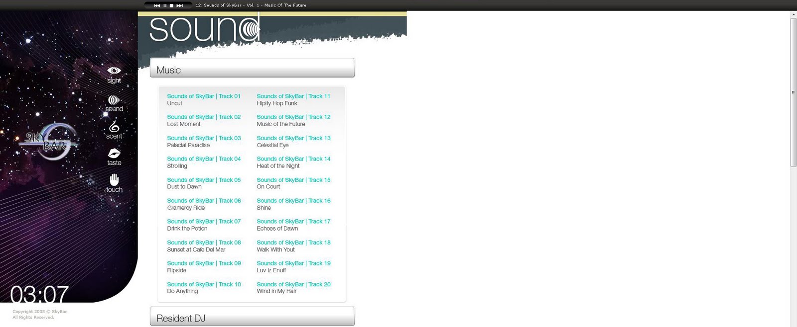
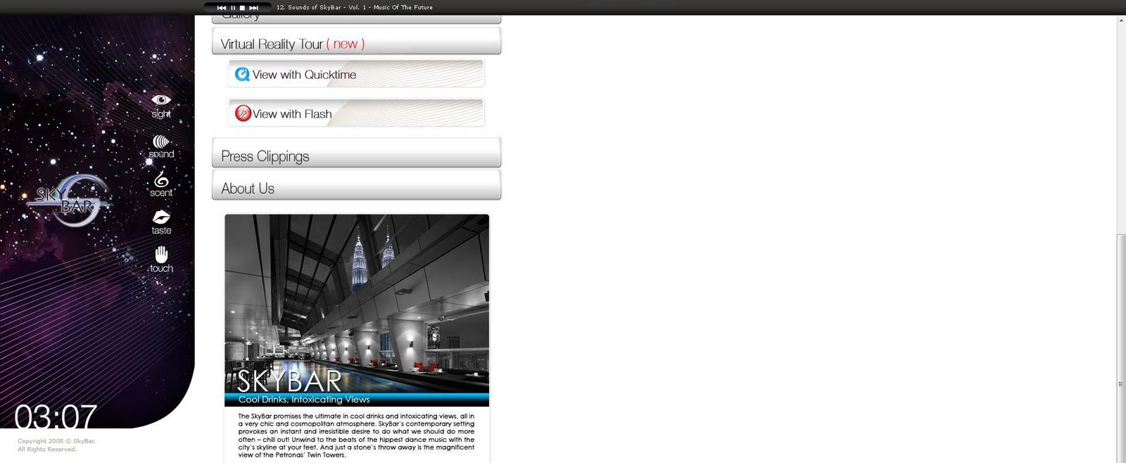
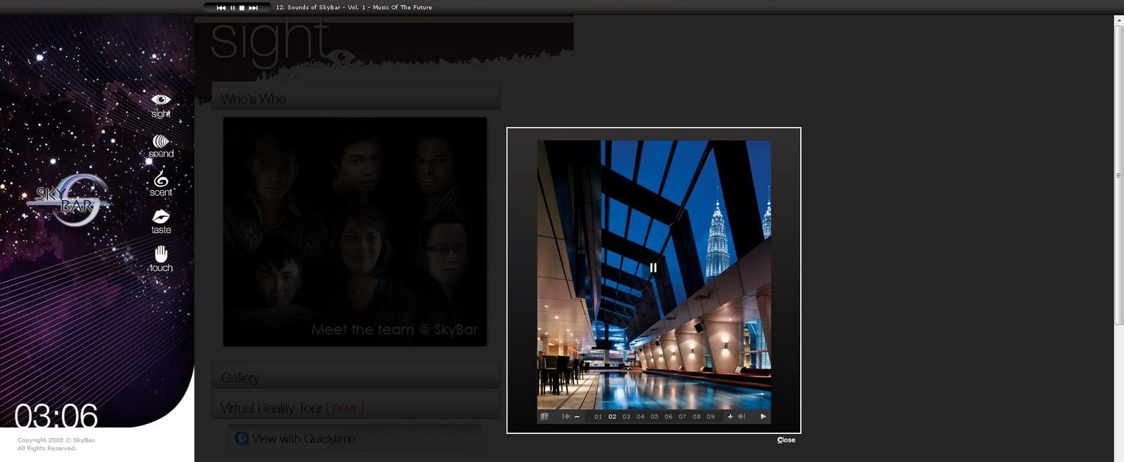

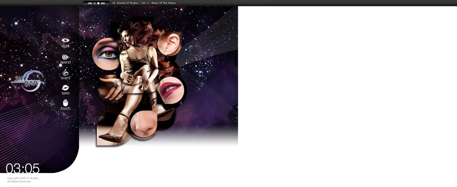
Sites: http://www.skybar.com.my/
Feedback:
1) Content-wise
- Indirect reference to each categories/content group
2) Design-wise
- Cool drop down content from the buttons yet the buttons are not designed nicely
- Lack of consistency in overall design (between the left hand side frame and the body of the website
- Website was so crammed onto left hand side of the screen. Uncomfortable to view
3) Function-wise
- Convenient cocaktail menu viewing.
Competitor Site 2: Over Time
Screen Caps

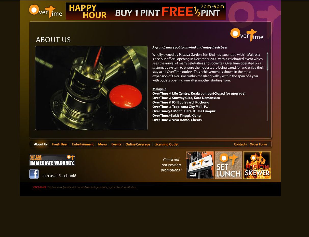
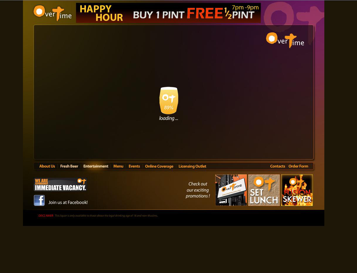
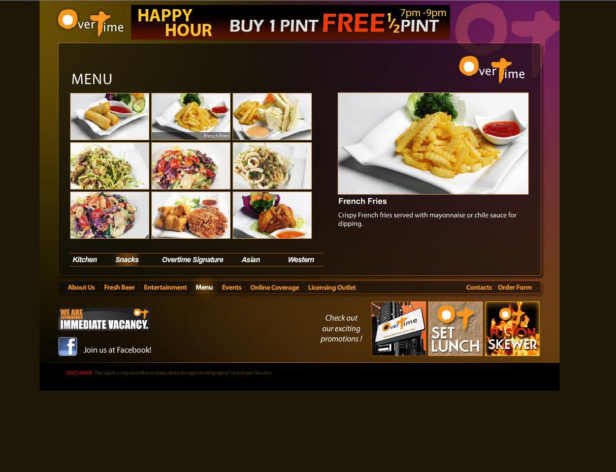
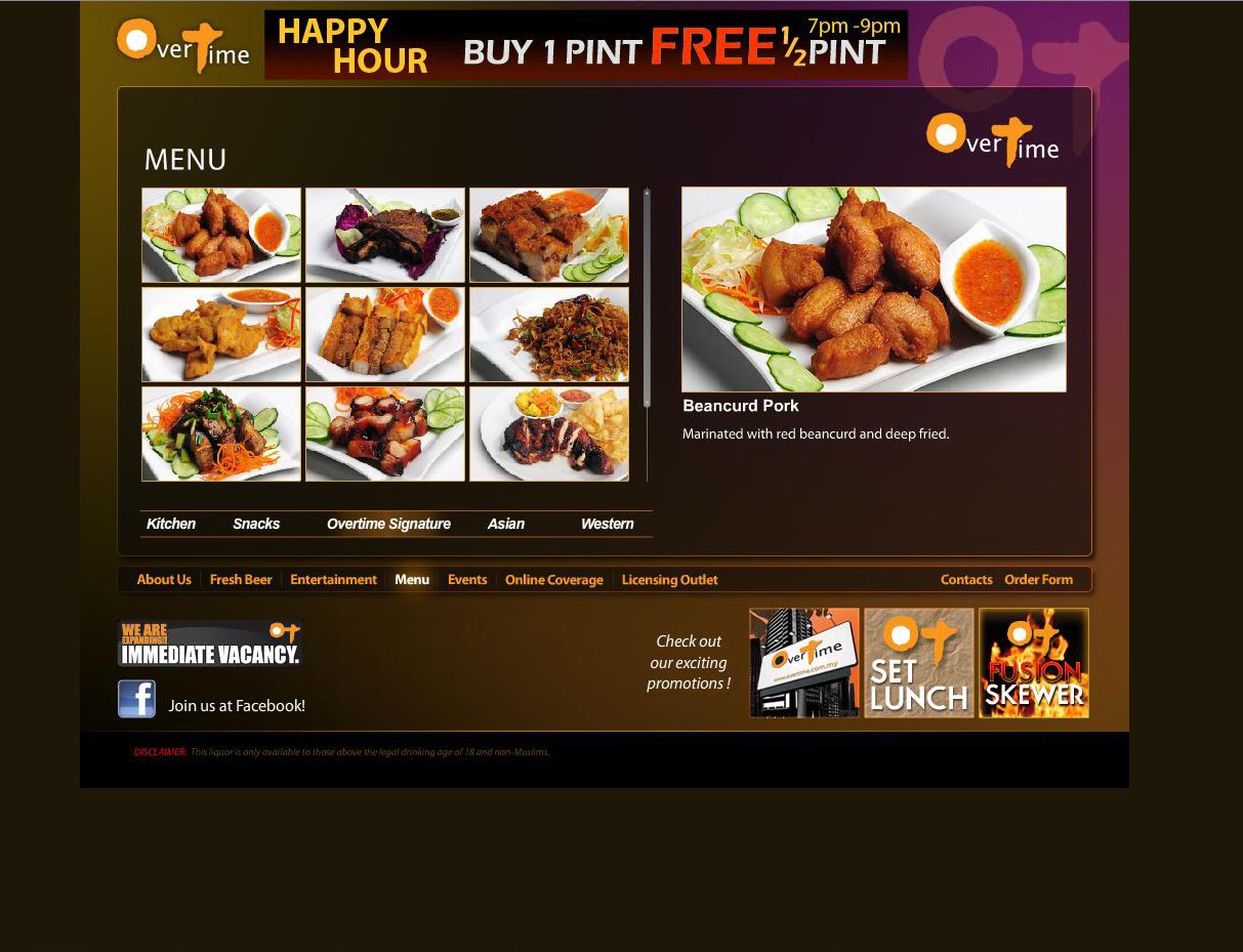


Feedback:
1) Content-wise
- Menu levels of contents that are arranged nicely into smaller chunks of info and categories.
2) Design-wise
- Promotion banner is placed right at the top. However it doesn't striked the balance with the main logo of the site.
- Dark colours. Look high class and chic at the same time
- Nice loading bar
3) Function-wise
- Can view individual items as well as download the full menu which is very convenient.
- Straight forward video and photo gallery function
- Navigation bar at the bottoms which are not very attention-grabbing
- Recruitment logo is too small to see
- Fonts for promotions sections are not eye-catching enough.
- Order forms are also too small to be spotted immediately
Competitor Site 1: ilLido
Screen Caps


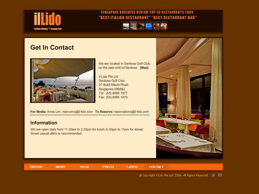
Feedback:
1) Content wise:
- Straight forward naming system. Clear categorization of contents
- Information is broken into small chunks so it can be read more easily
2) Design wise:
- Has lots of space for picture display
- Design is minimalistic but somehow unfinished and too simple.
3) Function wise:
- Typography of the banner can be better
- Viewing gallery is a bit confusing when the main Navigation buttons are at the bottoms but photos are at the top without any explanation
- Navigation bar is not attention grabbing enough due to unconventional placement.
- Pop up window for menu is a bit inconvenient.
Subscribe to:
Posts (Atom)